Tuesday, 31 March 2015

DRAGON'S DREAM TAG IT ON #187 - TOFFEE AND LACE

So, Toffee And Lace. How hard could it be...but...I REALLY had to think about this one and I'm not really sure why. I was determined to find an alternative way to include the lace theme as I'm not really a lacey person as a rule. I decided to use a lacey leaf stamp set I've had for ages and I hope that will be okay.

In the end I decided to break out my alcohol inks. I used Butterscotch (for the toffee element), Terracotta and Willow to create a background by splodging them on a glass mat and swiping the tag through the ink. I used what was left on the mat to colour some seam binding. I then stamped an assortment of butterflies in black Archival Ink. Once that was dry I overstamped lacey leaves in gold and then over that I stamped the words Le Papillon and some smaller lacey leaves in white. I really love how it turned out. I edged the tag with black ink and left it at that.


you can see the gold better in this picture


I think I might just about squeak in for this challenge. Must do better next time.

Lx

Monday, 30 March 2015

Wednesday, 11 March 2015

DRAGONSDREAM TAG IT ON #186 - WHITE AND A NUMBER

Another great challenge over at DragonsDream and I have set myself the additional challenge that I can only use stuff from my scrap box (sooooo many scraps; so little time :oD) so this is what I came up with


The image and sentiment are from a great set by Viva Las Vegas Stamps. The sentiment cracks me up every time I see it. I chose to stamp them onto Kraft card and coloured the image with Prisma Pencils.


I tore around the image to reveal the white core and edged the tag with white paint. I also stamped my sentiment in white and heat embossed it just to tie in the theme a bit more. I hemmed and hawed a bit when it came to adding the number element so I was pleased to find I had a piece of kraft paper with numbers on in my scrap box AND I found this cute staple with the word "Giggles" on it. Seemed appropriate so on it went.


HAD to use a bulldog clip for the top again. I really like that and it seemed to balance the tag as well as tying in with the silver staple quite nicely. Job done. Can't wait to make the next one now. I think I'm hooked.

Lx

Saturday, 28 February 2015

HMFMC#188 FRIENDS

Just about squeaking in with this one as I coloured an image earlier in the week and then hated it when I matted and layered it. I had to start again from scratch...plahhhh

Anyhoo, this week's challenge at House Mouse and Friends Monday Challenge is Friends and if you're in a tight squeeze like this little guy then one thing you most definitely need is a Friend. With Spring in the air I couldn't resist this gorgeous image with Forsythia in it. I love it.


As ever, my weapons of choice were Copics and Prisma Pencils and I added a little sprig of silk Forsythia


I glossed the bird feeder for a bit of added dimension too


Have a great weekend all.

Lx

Friday, 27 February 2015

Pink, Hearts and MORE PINK....

I've been footling about with a tag for a challenge I spotted on Catherine's blog recently. I love making tags and they're a great way to use up all those little bits and bobs you accumulate AND try out different techniques on a smaller scale. It all started when I found this lovely Stampotique girlie in my stash, long neglected and needing some TLC. Quick as a flash I coloured her in before rummaging through my offcuts to see what I could do to brighten her life a little...


First I needed some layers, so I painted a tag with Orchid Fresco paint by PaperArtsy before layering some dots over the top with texture paste. I've discovered that the paste sucks the colour of the paint up as it dries so I got a gorgeous soft pink colour to offset the darker pink of the paint. Cool!

Next I added a little offcut of pink Coredinations card which I embossed with hearts and then sanded back to reveal the colour. I die cut the word Love in dark pink using a Spellbinders die and added some glossy accents to make it stand out a little more.


More hearts, some twine and some sequins to finish. Not forgetting cupid's arrow, which I painted and glossed for extra oomph! A little bit of glitter on her dress and a tag is born, Ta Dah!


I'm going to enter her into the DragonsDream Tag It on Challenge where the theme is Pink and Hearts

Lx

Sunday, 22 February 2015

The Journal Journey Continues with Drips and Drops

In for a penny in for a pound... I've dipped my toe into the journalling pool and I really enjoyed it so this week I decided to throw caution to the wind and just dive on in. The February challenge at Country View Crafts caught my eye and seemed a good place to start. The theme is Drips and Drops so I set to with some oil pastels and alcohol inks to create this


Unfortunately the Liquitex doesn't make photographing the page too easy so I took another picture with my journal standing up to see if it was any better


I laid down the background with oil pastels and then dripped some alcohol inks down the page to look like trees. I wanted to use my Tim Holtz clock face again. I really like it so I die cut it in white and went over the whole lot with Mod Podge to stick and seal it all.

Next I did my stamping. It was all done with archival ink. My spectre is from a set by Andy Skinner. I just faded out the heart in the middle. The birds are a Tim Holtz stamp I'm sure everybody is familiar with and the flowers are, I think, from an Inkadinkadoo set I've had for ages.

Back to my trusty labelling machine for the words. I coated the whole page in Liquitex Pearlescent Medium to give it an ethereal quality, added pewter crackle paint at the corners of the pages and dropped white and silver acrylic paint onto the page to make spectral orbs...


Lx

Tuesday, 17 February 2015

A Road, As Yet, Untravelled...

NOT something I've done a whole lot of but I want to do some journalling and some collage. A bit scary, but I really enjoyed the pieces I did for PaperArtsy and have fallen deeply in love with Fresco paints into the bargain. Anyway, why limit yourself to just one thing when you don't need to? So, I hope you'll forgive my clumsy efforts over the coming months... Hints and tips a most welcome

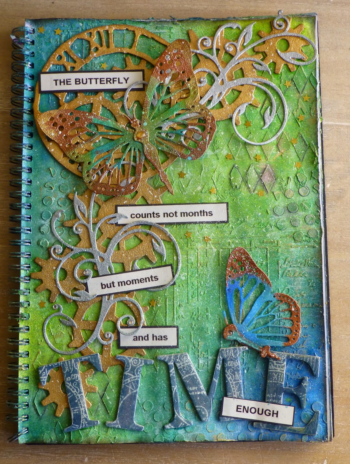
Here is my first page, which I have had to make with what I've got in my card making stash anyway so it's not going to light any fires I'm afraid... but it was useful to help me learn the process of layering colour etc. Repeat after me "my heat gun is my friend" :oD I started with blues and greens because they don't mix to make brown or grey... if you get it "wrong" it just makes a green blue or a bluey green...

I love the sentiment and it was where the page started in my head. Originally I intended to stamp it but ended up using my labelling machine instead...


I've used Tim Holtz dies to cut the clock face and the cogs from some cardboard packaging. We've all got plenty of that, right...

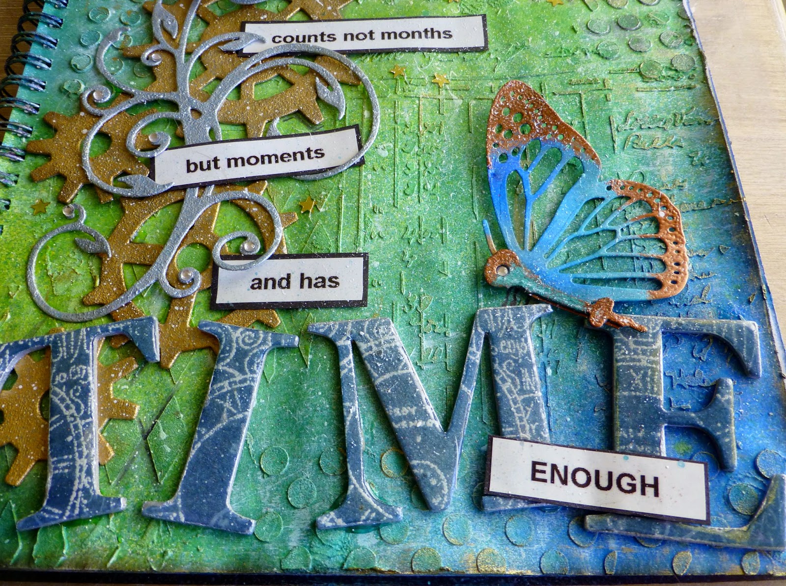
The butterflies are die cuts from a set called Mariposa that I got from Create & Craft. I know they're going to be a favourite so brace yourselves to see them a lot :oD

I used the clock hands to make the bodies of the butterflies and I stamped some chipboard letters with clock faces before embossing them in white. I coloured the letters with distress ink and then coated the whole lot with Glossy Accents to give them dimension and contrast.

For the colour I used a mixture of Dylusions sprays. I've got a green one and a blue one so I used those and they mixed to make a nice sort of blue/green shade too. I don't have any Treasure Gold yet (it's on my list) so I used good old heat embossing in copper and gold to gild the butterflies. The cogs and the clock face are coated in gold acrylic paint and the flourishes are coated in silver acrylic.

I got all the way to the end and wished I'd added more white in the initial stages. Hey ho! Live and learn I suppose.

Anyway, the main thing is that I enjoyed it and I already know what I want to do for my second page. I call that progress of a sorts.

Lx